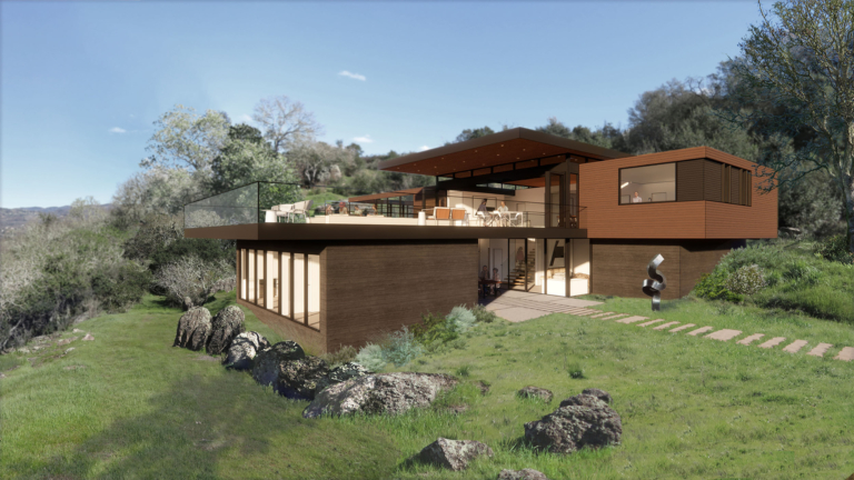
In the Napa Valley, home design responsive to the landscape is essential for creating a harmonious relationship between architecture and the natural environment. When placing a building into a landscape, the architecture is bound by a duty to exert its own presence but to do so in complement to the host environment. The rigor and order inherent in good design is afforded a sense of timelessness when thoughtfully blended into the natural world it occupies.
Our Napa Art Retreat project is an idyllic, wine country anchor for a retired couple with wanderlust who enjoy the art and energy of Burning Man’s fleeting and nomadic existence. Nestled in the Napa Valley and taking advantage of the wild, yet manicured, and often fragile beauty that surrounds it, their home establishes a sense of permanence and a place in which they can appreciate both natural and man-made beauty.
The homeowners met William Duff when they both served as board members of the di Rosa Center for Contemporary Art, a non-profit organization in Northern California’s Wine Country. They commissioned a new construction home on a Napa hillside which rolls dramatically down the Valley to views of Mount St. Helena in the distance.
The often-fragile nature of the Napa Valley’s striking beauty was at the forefront for us, the clients, and the fire department as the front line in the effort to keep Napa safe. The use of resilient materials and the arrangement of the home’s constituent parts were key factors we considered in creating a sense of permanence and sanctuary.
Response to Topography
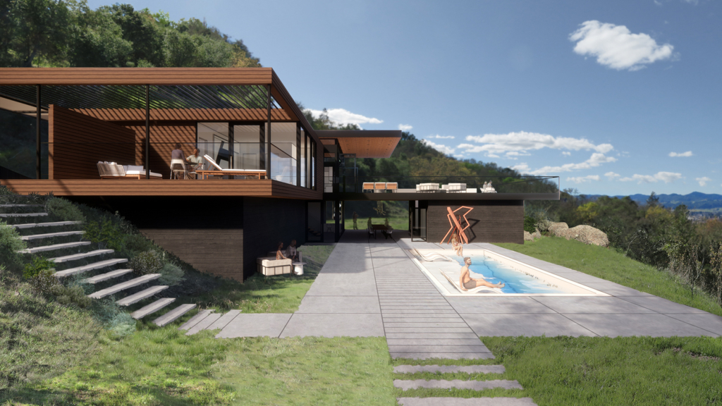
The drama of the site is generated by the topography. Good architecture always responds to context, but that reaction becomes even more critical in such a pure, uncultivated site. The graded terrace created a step in the topography that leant itself well to a home that could cascade down the hillside.
“The site had been graded by a developer before selling the land to our clients,” explained WDA Residential Practice Manager, Jim Westover. “We took advantage of that and minimized the impact on the landscape by allowing the house to step down the hill but remain anchored into it.” The topography was also useful as part of the fire resistance strategy. Firefighting water retention tanks, powered by gravity and passive pressure, were located uphill and embraced the potential energy of the terrain’s slope.
The big move was to articulate two floating planes which would hover above, and in harmony with, the hillside sweeping underneath, giving us a way to naturally separate the desired functions and occupancies of the house. Guest and public outdoor spaces were on the lower level, with the upper level reserved for private spaces.
Trusted Partner
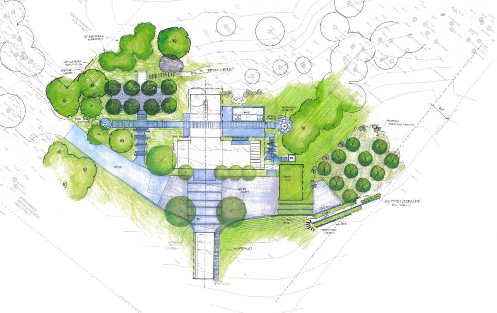
The timelessness interplay between the manmade and natural conditions was achieved through a close working relationship with Kate Stickley of Arterra Landscape Architects.
“Our goal is to translate the architectural design and transition it to the natural landscape,” Kate said. We wanted to engage the edges and borrowed views of neighboring wildlands as much as we could and make the home feel like it has always been there. We also wanted to make it so the clients could venture out onto the land. There were inviting places walks away from the house where little moments would occur out in the landscape.”
From framing views, to orienting the home around our clients’ favorite tree and nestling a hot tub next to oak and rock outcroppings, the landscape played a part in all our decisions in creating a home design responsive to the landscape.
The Ordered and the Organic
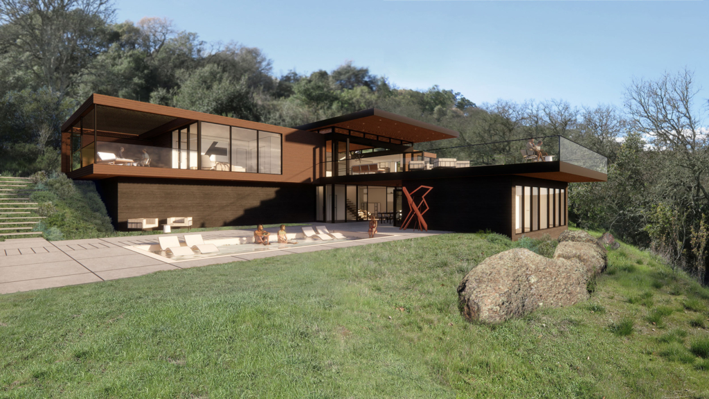
The central views were quintessential Napa Valley with ordered vineyards and wild forested valley slopes – something the architecture could respond to. There was a deliberate move to order the home around a strong but balanced central axis complimentary to the organic, sweeping hillsides.
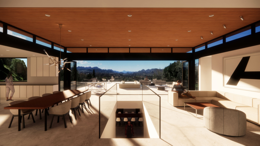
The core axis, starting at the main entrance and leading across the driveway to a cave big enough to hold the couple’s touring RV, is center aligned with the floating plane above. Leading out to the bridge, the elevated axis connects a sculpture deck with our clients’ preference for the spectacular views down the Valley looking towards Mount St. Helena. There is an elegance in the axes of the two main volumes, connected by the bridge, and the shifting drama of the central stairs flowing between the upper and lower floors.
“We wanted to blend and fold the manmade into the natural landscape,” Kate said. The axis “set the tone for a very organizational approach. Our landscape design extends the floor plan out further than the building walls.”
Responsive Use of Materials
We chose materials that directly reflected the nature of the site. The lower board formed concrete walls anchor the structure, rising into an open wood-frame for windows, terraces, and outdoor spaces. All of which is shaded by overhead trellis and that critical gesture of the large, floating plane of the central roof.
There were existing boulders on site just in front of one of the walls. “Choosing a concrete base and locating it next the boulders made the home seem more permanent, as if the house had grown up out of the land,” Jim explained.
Warm wood siding covered with an enhanced fire resistive wood frame was a strict requirement of local fire codes and key to the resilient design of this wine country residence. “This home showed how a restrained architectural palette can extend into the landscape and become an extension of the architecture,” Kate said.
Art and Nature
While there was no dedicated gallery space in this home, our clients’ goal was to immerse themselves in their art collection. The home, in-turn, became a gallery in-and-of-itself. “We closely collaborated with our clients and the landscape architect in deciding where artwork could go,” says Jim. The design included art and sculptures at key moments in the procession between spaces. Some of these became focal points accentuated by their location on axis, fostering the immersive experience our clients were seeking.
Like it Has Always Been There
Creating a sense of timelessness and natural permanence is an exciting challenge when it comes to placing a manmade object into in a rustic landscape. The rigor of our Napa Art Retreat project exemplifies those qualities and shows how home design responsive to the landscape and art can be finely balanced in a harmonious home.
Written by Neil Ginty, Architect
Contributors
Article: Jim Westover, AIA, LEED AP; Eunice Lin, Architect; Sarah Mergy; Wendy Osaki; Brenna Daugherty
Project Team: William Duff, AIA, LEED AP; Jim Westover, AIA, LEED AP; Eunice Lin, Architect, Jon Houk
Renderings: Glorimar Irizarry Delgado, Alex Croft; Adan Aspericueta, Clair Ryu
