Retail is an ephemeral industry, always changing with the seasons. Adaptive reuse is the renovation and reuse of pre-existing buildings for new purposes, in line with contemporary design. Both rely on reinvention. When paired with retail, adaptive reuse buildings can elevate brands by physically connecting them to the past and giving them a sense of timelessness.
We approach adaptive reuse design by celebrating the old and new. “I’m fond of the juxtaposition in combining old elements with new materials. It brings a richness to the design,” says Commercial Practice Leader David K. Plotkin. WDA founder William Duff finds adaptive reuse as creative and challenging as coming up with a brand-new building. “It’s exciting to find ways to give existing buildings new life.”
Adaptive reuse use also supports our approach to sustainable design. David notes, “It can be easier to build from ground-up, but a significant portion of carbon emission comes from building materials and waste generated for new construction projects. By repurposing existing buildings, we can preserve resources and reduce on our carbon footprint.”
There are many challenges when renovating older buildings, including working with historic districts and local planning departments, along with bringing them up to current building codes for safety. William notes, “Sometimes you can’t meet the user’s needs because of these restrictions when re-using existing buildings. However, cities have the incentive of spurring growth and development. To do so, they will need to liberate some of the planning and zoning codes, enabling the latitude for more adaptive reuse.”
When working within a historic district our goal is to both preserve and transform buildings in a modern way. Three examples from our retail practice illustrate how we approach adaptive reuse and design in a historic district. These projects all celebrate and recognize their sites and respond to local design conditions, yet effectively showcase these high-end retail brands.

A Historic Survivor – Isabel Marant
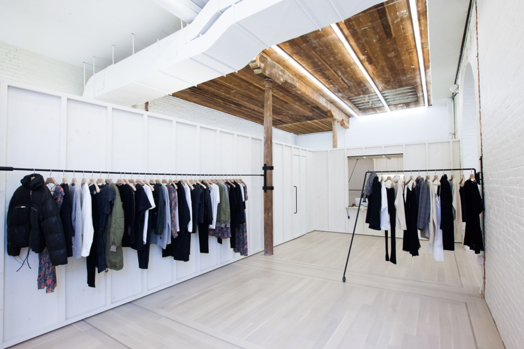
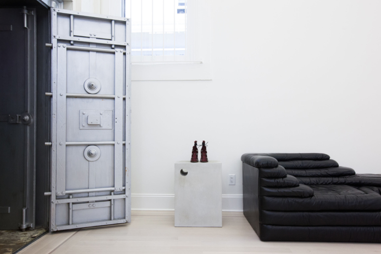
We worked with Isabel Marant to implement their modern brand while maintaining the character of their façade, located in the historic Hotaling Building. By working cohesively with our international client and local city officials, we successfully navigated the city’s planning codes for a historic landmark including restrictions on any exterior changes. We kept the historic shell and streamlined the interior to complement this modern clothing brand.
The boutique is located inside the beautiful Italianate building which survived the 1906 earthquake and fires. Originally built in 1866, it is one of the best-preserved structures in the Jackson Square Historic District. The building features striking classical pediments, and ornamental cast iron details and shutters. Inside, we kept the original wood floors and exposed plank ceilings, and arched brick walls and hand-turned wood columns — originally built for a stable in the building’s earliest of usages.
The color palette is minimal. Exposed brick walls painted white and new whitewashed wood panel partitions allow the merchandise to stand-out. A geometric layout of simple linear ceiling lights adds a crisp and refined look to the interiors. The combination of simple, yet highly finished details respect the building’s character and highlight the brand’s sophisticated charm. The store gives the space a modern personality without changing its classic historic brick and cast-iron structure.

Classic and Modern – CH Carolina Herrera
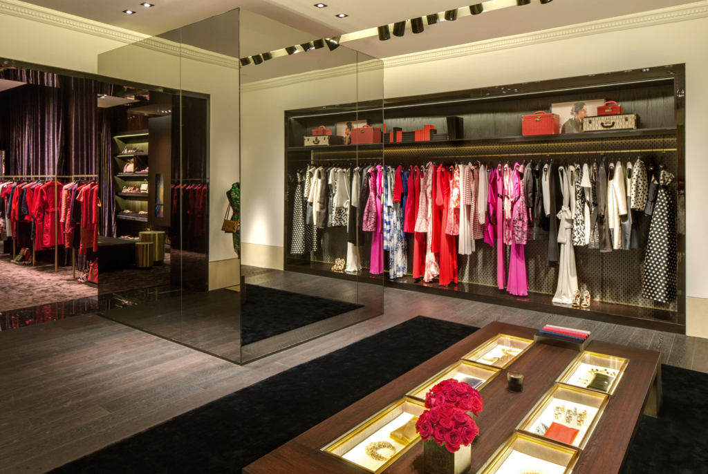
Continually pushing the boundaries of style with her juxtaposition of classicism and modernity, our CH Carolina Herrera project follows the mantra of her identity. An international brand, we looked to both global and local trends when giving this space new life and folding it into our local fabric. Headquartered in Spain, our client appreciated our experience working with high-end brands and ability to navigate local planning hurdles.
This multi-level flagship store in San Francisco’s historic Union Square District, is characterized by high level finishes and well-curated lighting design, which emulate the warmth and intimacy of the designer’s brand. Originally a terra cotta clad loft, the building was once remodeled in 1939 by famed architect Timothy Pflueger in the “moderne style” with a steel, black tile and glass facade and a contemporary steel marquee. The current façade is an elegant, framed window wall of stone finish, with a parapet above, whose earlier loft origins are still evident. It complements the adjacent historic buildings with compatible scale and use of rich materials.

Simplicity in Design – 69 Maiden Lane
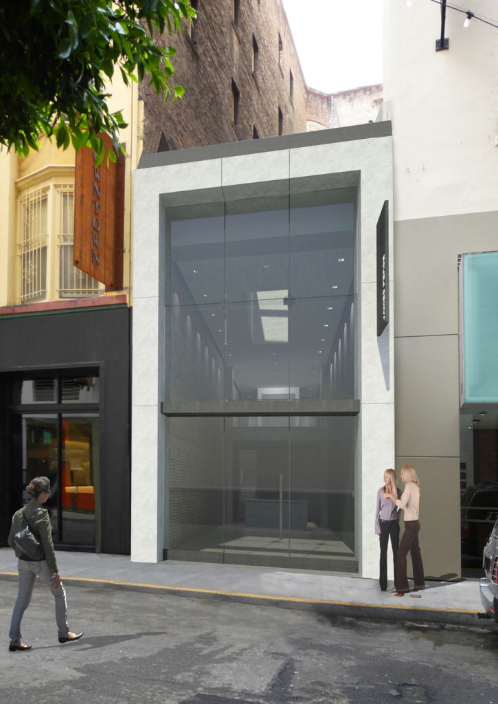
This former mixed-use retail building in San Francisco’s Union Square district called for careful engineering and creative solutions. The infill building is a thin two-story space inserted between taller neighbors, located on the historic Maiden Lane.
The new design for 69 Maiden Lane features a full-height showcase window which maximizes daylight and views. The façade is a contemporary modern frame of stone and glass that required negotiations with the city for approvals. The design creates a distinct expression yet relates in proportion, scale and detail in design to the neighborhood fabric.
During the renovations we uncovered an interior brick wall along one side of the space. Now preserved, it complements the new stone and glass façade. The upgrades we made included adding steel moment frames, reframing new exterior party walls and installing 60-foot concrete micro piles enabling the owner to decouple this building from its neighbor while maximizing usable square footage in this narrow space.
Let’s Work Together
Whether it is transforming exterior facades within a historic district or complementing buildings with a contemporary renovation, we love helping our clients imagine new and innovative uses for existing buildings. Adaptive reuse is design for a modern world. Contact us to continue the conversation.
Written by Steven Lovell, AIA
Contributors: William Duff, AIA, LEED AP; David K. Plotkin, AIA, LEED AP; Jonathan Tsurui; Chris Telles, Architect; Sarah Mergy; Wendy Osaki; Brenna Daugherty
