How can architecture help grow and define a thriving business? Some examples can be found in our recent work for local, family-owned restaurants. Mom-and-Pop restaurants often develop a following by focusing on delivering delicious food with excellent customer service. So, when a local legacy business takes the next step—by re-envisioning an existing space or opening a spin-off location—our role is to design a new space that honors the original by letting the menu shine.
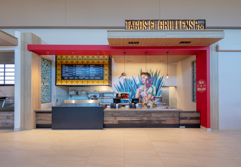
For the food to take center stage, we design with an eye towards simplifying and unifying the space, often adding a signature move to grab customers’ attention. In a new environment for Tacos El Grullense—a food court in Hillsdale Shopping Center—the owners of a traditional standalone restaurant wanted to evoke the artistry of their culinary creations when introducing their brand to a new audience. In addition to helping navigate the mall’s infrastructure and tenant guidelines, we designed using a materials palette associated with the owners’ hometown—framing the space around the demonstration kitchen and cashier stand with vivid colors, geometric motifs, and rustic materials to make room for a visual anchor point on the restaurant’s back wall. There, we collaborated with Twin Walls Mural Company, who created an innovative tile mural depicting a woman in traditional dress surrounded by Jalisco, Mexico’s vibrant flora and fauna.

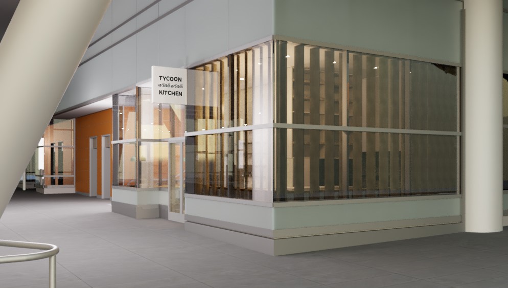
In contrast to this bold, eye-catching art as a focal point, Tycoon Kitchen— located in a corner space in San Francisco’s new Salesforce Transit Center—creates a calm, reflective haven in the midst of the bustling financial district. The owners of WDA-designed Mr. East Kitchen called on us to view the new Tycoon Kitchen storefront with them to make sure the building and infrastructure could support their restaurant’s needs. Once they had leased the space, they hired us to channel the clean and comfortable atmosphere of their original restaurant for Tycoon Kitchen—a 700 sq. ft. tenant storefront with glass walls on three sides facing sidewalks, streets, and a public escalator. To harness abundant natural light while creating a sense of privacy inside and mystery on the outside, we designed a louver wall that filters sunlight and views, creating a soft glow and textured shadow patterns on interior walls.
