By Frank Steier
Contributors: Josh Chen, William Duff, Sarah Mergy, Phoebe Lam, Wendy Osaki

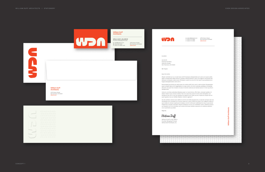
Unapologetically bold and modern, the letter’s curves highlight a free-flowing adaptability to the rapid changes of our modern world.
We are turning 25 years old this year! A milestone like this simultaneously evokes reflection on the past, appreciation of the present, and an aspirational focus on the future. Last year we launched our 2029 plan with a bold vision for our firm’s trajectory over the next six years. In doing so, we considered the changing world around us and looked inward at who we are and where we want to go. We emerged with a renewed understanding of our firm’s identity: a growth-oriented people-based practice with a deep passion for design principles and processes. To reinforce our identity and celebrate our 25th, we refreshed our brand with a new logo and website. No small task, here is a peak behind the process.
At its core, a logo represents the distilled, most concentrated essence of a company’s identity, and it must communicate a massive amount of information in a very small amount of real estate. “You often only have a moment of opportunity to convey to someone who you are, and those impressions are formed immediately and cement themselves quickly. The better a company understands who they are and what they are trying to achieve, the better the brand can convey that information,” says founder William Duff.
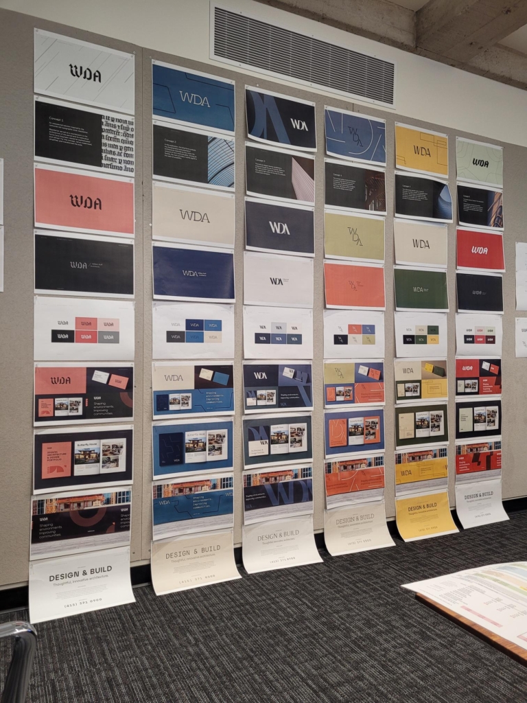
For the initial mockups of our new logo, Chen Design Associates (CDA) – the creative agency we partnered with – solicited information about our firm’s character and direction. Our response back to CDA was admittedly too shallow and surface-level. As a result, the first pass of logos they generated reflected that opacity of vision. They didn’t fit. We dug deeper and shared our Design Vision book with CDA for further insight. Subsequent iterations drew on much more candid feedback and helped us crystallize our understanding of our own identity, guiding ethos and vision for the future.
Working with CDA and being on the client side of the design exercise was deeply revealing for us. It reinforced the value of the design process: offering feedback, performing design critiques and iteration. The final product is the result of our commitment to that process. You get what you give.

Innovative design is at the heart of what we do at WDA, and championing Design was a necessary ethic for our new branding to communicate. We wanted the logo to do more than elicit a feeling or tone. It should relate to our Design Vision and represent the key principles we adhere to daily as architects, such as geometry, space or the relationship between mass and voids. The new logo also needed to communicate the inventive and playful qualities inherent in Design and the collaborative process that best draws those out.
“People are at the nexus of who we are and what we do, and it was vital for the new logo to showcase that,” says William. Our logo design supports this belief by demonstrating that it’s not about the individual but the entire company. In the logo mark, the “A” is deliberately separated out and punctuates the graphic so that the final statement reads “Architects.” Similarly, the new website showcases the breadth of WDA’s work in more cohesive less siloed ways, highlighting the collaborative nature of the firm at large in a modern and forward-thinking style.
The formation of our 2029 plan is a result of WDA’s aspirational philosophy. We wanted the new logo to represent the bold forward-thinking mindset that the firm embodies today. When asked what she felt the new logo highlights best, our Director of Operations Phoebe Lam said, “It reflects a depth of experience and lessons learned. We’ve undertaken and gone through so many challenges since the inception of our last logo. The work we have done since is a testament to our resilience in the face those challenges. Our logo no longer needs to communicate confidence in the way our previous one did because our work speaks for itself. Instead, the new logo projects ambition and forward momentum.” Unapologetically bold and modern, the letter’s curves highlight a free-flowing adaptability to the rapid changes of our modern world.

Over the last 25 years, not only have we changed, but the world has changed, and our current and future clients’ tastes have changed. However, our belief in the design process and putting people first has remained constant. When asked about the fundamentals of the creative design process, Josh Chen Founder & Creative Director of CDA said, “For us as designers it’s about starting with an open mind and seeing what emerges as the process unfolds. It’s not being afraid of iteration and refinement.”
Our new look is not only a tool for marketing, but a north star to remind ourselves of who we are and where we want to go. Cheers to the next 25 years and beyond!
Contributors: Josh Chen, William Duff, Sarah Mergy, Phoebe Lam, Wendy Osaki